Double Click on the Youtube Clip to make it play, Thank You.
Tuesday, 11 January 2011

Wednesday, 5 January 2011
Mistakes during filming
During the filming of our trailer, the first mistake was with the props. We wanted to make a scene where one of our characters gets stab but inside the tent to make a shadow effect so we didn't want to make the scene disturbing. We decided to then change the idea and use this white large painting pad used for artist to paint on as a cover. We chose the painting pad because it was better to see people shadows when the light is shining to it. So it worked out better than we hoped.
Another change we made was the location of the forest. We used some footage at Trent Park to show the location of the forest but whilst we filmed it was so dark we couldn't film anymore so we change the setting to Coldfall Woods. It was an advantage of filming at coldfall woods because coldfall had a lot of trees around making it more like a forest unlike Trent Park had mostly fields of grass. So it was a blessing in disguise changing to coldfall woods.
Other than that, all of filming to plan and we overcome come our mistakes during the course of filming and also we improved our ideas from our mistakes and it gained a lot through the film.
Props used in film
Kenny's Glasses
Camera and Video Camera
Tent
Chair
Lunch box
Tripod
Light projector
Make up inc. eye liner, white powder
fake blood
Glass bottles
Rope
Diary
Balaclava/ black jacket
Locations:
At University/ Fortismere school North Wing
At the car park / Wood Green car park
In Kenny's bedroom / Vessy's House
In the car, on the way / Selin's Car
At the forest / Trent park and Coldfall Wood
Actor Profile

Ash: Selin Salih
D.O.B: 22/07/93Hometown: Tottenham
Background: Turkish Cypriot
Occupation: Full time Student - Fortismere
Hobbies: Reading, swimming, watching films, cooking
Likes: The colour blue, poems, listening to music, teamwork, shopping, creative writing
Dislikes: negative, selfish people, hypocrites, violence and smokers
Why there suitable for the role: because she is confident, good at acting, popular, was part of creating it so knows excatly what is needed for the role and was able to make time for filming.
Kenny: Alex Dann
D.O.B: 04/08/1992Hometown: Barnet
Background: English
Occupation: Student
Hobbies: Football, sports, clubbing
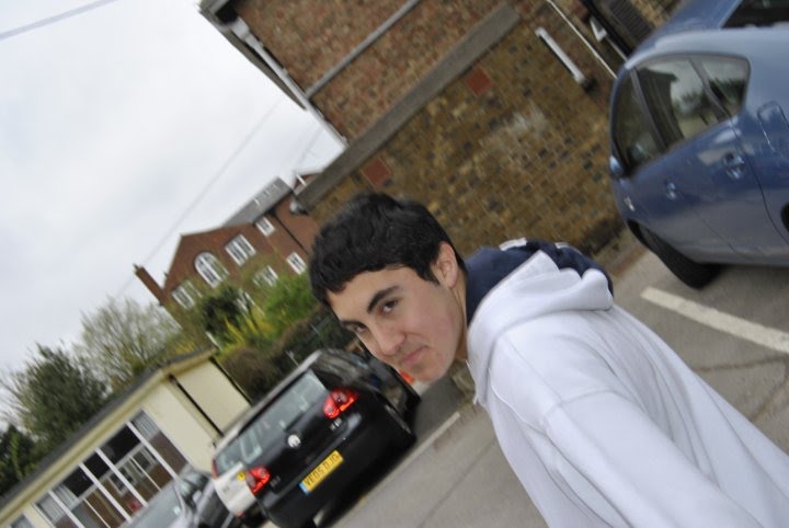
Likes: Music, partying, hanging out with friends, watching films
Dislikes: Boring life, heights, being told what to do, bully's
Dislikes: Boring life, heights, being told what to do, bully's
Why there suitable for the role:

Troy: Ivan Bochukov
D.O.B: 22/11/1989
Hometown: Southgate
Background: Bulgarian
Occupation: Waiter
Hobbies: Watching/ playing football, going out with friends, researching football hooligans
Likes: Making people laugh, attracting attention, meeting new people,
Dislikes: Gossipers, rude people, soap operas, school work
D.O.B: 22/11/1989
Hometown: Southgate
Background: Bulgarian
Occupation: Waiter
Hobbies: Watching/ playing football, going out with friends, researching football hooligans
Likes: Making people laugh, attracting attention, meeting new people,
Dislikes: Gossipers, rude people, soap operas, school work
Why there suitable for the role: Ivan showed great emphasis and commitment to playing this role. He gave up a lot of his space time and we met at many times to plan and film it. Although Ivan was not part of the directing crew he gave some useful points and we took into consideration his advice and help. Ivan's personality is very similar to Troy, as they are both popular, loud, tough and bossy so was easy for him to act out and play the role effectively.
W
W

hy there suitable for the role:
Character Profile Part 2 with images
Name: Ash (Ashley)Age: 18

Occupation: University Student
Appearance: Good looking, in good shape,
long hair, lots of make- up,
Personality: Caring, Outspoken, Respects other people,
Likes: Jewellery, make-up, expensive bright clothes, high heels, parties, going out with friends, being on the phone and her boyfriend Troy
Dislikes: Violence, rude, ignorant, unhygienic people
Typical phrase: "that's so cute"

Age: 18
Occupation: University student
Appearance: Small, Skinny, Messed up hair, Tucked in shirt, Diabetic retinopathy (Eye disease), not attractive, check shirts with sweater vest.
Personality: Well mannered, Shy, educated, alienated.
Likes: Chess, Sci-fi/ horror films, Computer, books, indie music
Dislikes: Stuck up men, People that push others around, people that don't take their lives seriously
Extra info: Is a straight A student, talks formally, Middle class, Studies Physics and Maths as a degree.
Character Profile
Name: T (Troy)
Age: 19
Occupation: University Student
Appearance: Rough looking, attractive, tall, muscular, big chains, ear piercing, always wears a hat, baggy jeans and tattoo on neck of Ashley.
Personality: Masculine, rude, aggressive, confident and vain
Likes: Football, girls, parties, smoking, drinking and loud music
Dislikes: Studying, people different to him, living with others
Typical phrase: "I'm just living my life" "you wish you were like me"
Extra info: Disorganised, upper class, football scholarship, always has a cigarette in hand and talks in slang.
Tuesday, 4 January 2011
Magazine Cover: Planning and Magazine Analysis
Magazine cover is part of the many sections for this media coursework along with the film trailer and the film poster. Before I make my front cover for my magazine I need to research on other Film magazines and see how they are so effective. The film magazines I have researched were Empire, Total Film and Sight and Sound. To analyze front covers on film magazines I need to write about the image, the layout and the content. This whole analysis will help me be more prepared towards creating my film magazine front cover relating tomy film trailer for my coursework.

The image on Empire magazine usually holds its own footage. Empire magazine use one main image of the character in the film they are covering. The image of the character is very iconic for example, this Stars Wars character is playing around like the character would do in the film. What is special about this picture it gives out a 3D effect when it is in front of the Empire Logo and the tongue is sticking out.
The content of the magazine is brief and catchy. In this magazine the wording is just the title and catchy phrase at the bottom. there isn't a lot of content around the magazine which rarely happens on magazines. What is special about this is edition is the quote at the bottom saying, "how wude" which you don't usually see from film magazines.
Layout: With this layout relatively not a lot is on this magazine. Most Layout is filled with text around with the image in the middle. Whereas, This layout is framed in gold and that could show that this magazine edition is limited or exclusive. With the text it is only shown at the top and bottom unlike most magazines having the text on the sides as well as the top.
 With this unique film magazine the image is very distinctive image. This is image is on Clint Eastwood and the shot the magazines took on Clint Eastwood is Close up shot showing himself from head to shoulders.
The layout of Sight and Sound magazine is familiar to the big film magazines. Firstly, you can see the title is not directly in the middle like most magazines are. whereas, the title of this magazine is placed on the left. The colours that is placed on this magazine are average. They still have their original colours of yellow,black and red on the title box and on other side the bar code and other details. These colours are not a distraction to the black and white image of Clint Eastwood.
The content of this magazine is very formal unlike the 'Stars Wars' Empire magazine. It has some of the font bold showing the reader the important content of the magazine.
 The layout of this image is was very intriguing to me because of the style Total Film made. The newspaper cover relates well to the whole theme of the film from Superman.
The context with this magazine edition is very formal taking the ideas off a newspaper. For example, the article "Superman Returns" is catchy which newspapers use to draw in their readers, especially on the front of a newspaper.
The image in this magazine is iconic in the sense of the film because this is the outfit Clarke Kent (Superman) would wear for a disguise. With the glasses and the hat hiding his true identity .
 This image looks to me that they have taken this in the studio specifically for this magazine cover. You can see that he is posing by the way he is standing and holding his weapon. The meaning of the image for me is that the character is showing no fear holding the guns and is very serious for what he is about to do.
The content of this magazine is very straight forward because there are only a few words. The movie title stands out the most because it is bold and has its own layout to make it special. The other content is about other movies and other persuasive skills to lure the reader in. They leave to content short because they have the rest of the information inside the magazine for the viewer to read.
Subscribe to:
Posts (Atom)